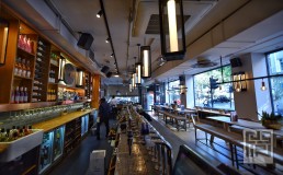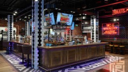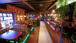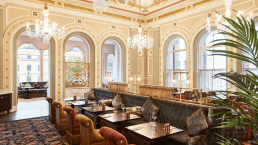
Update to the well-established high street bar for Mitchells & Butlers
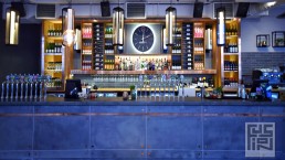
Creating a new modern identity to the All Bar One brand and challenging the brand’s current perception. Fusion By Design looked to connect with a millennial audience with sophisticated and high quality interior design.
THE BRIEF
Our brief was to update this well-established high street bar to create a new modern identity, ensuring that the brand can connect with a millennial audience with impactful, sophisticated and high quality interior design. We took time to consider the history of All Bar One, its key features and what makes it recognisable.
Consideration was given to the overall brand identity, not just the interior design. We acknowledged the need to declutter, to create a cool, calm environment with a simplistic and stripped back design, eliminating the unnecessary with honest beautiful materials and details. Heavily using the phrase “less is more” coined in the mid-century we created a modern-day version combining this concept with the popular Hygge style.
THE DESIGN
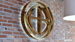
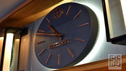
We reviewed the logo and introduced a symbol to allow the brand to become recognisable as an icon and not just a name, introducing a symbol with the initials A.B.O in a slightly abstract way. We extended this idea of removing the unnecessary by updating the font with a sans serif, decluttering to provide crisp clean modern lines.
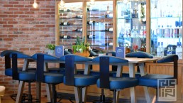
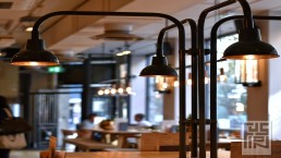
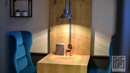
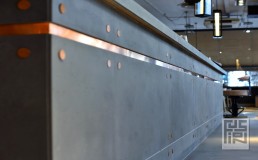
The new simplicity echoed by the logo is also reflected in the interior with a simple palette of neutral and natural finishes within the tiling details, fixtures and fittings. Materials are honest and stripped back, void of embellishment, with polished concrete and natural oak. These are complimented with cool neutral grey tones with highlights of vibrant bottle green to symbolise the importance of the presence of wine bottles and the history of what All Bar One has always been renowned for – A reliable and stylish wine bar.
